 case study
Cargolia is a car shipping company that offers fast, affordable, and fully insured transport services with real time tracking but their old site didn't show it. The forms were the real problem: confusing to fill, too many fields with no clear order, and this was causing drop offs. On top of that, the site looked dated and didn't build the kind of trust a logistics company needs to win shipments.
The goal was to make requesting a shipment feel effortless. I rebuilt the forms to be clear and step by step, and reworked the visual system to feel modern and trustworthy. The result is a site that looks credible and guides people toward a quote instead of losing them on the way.
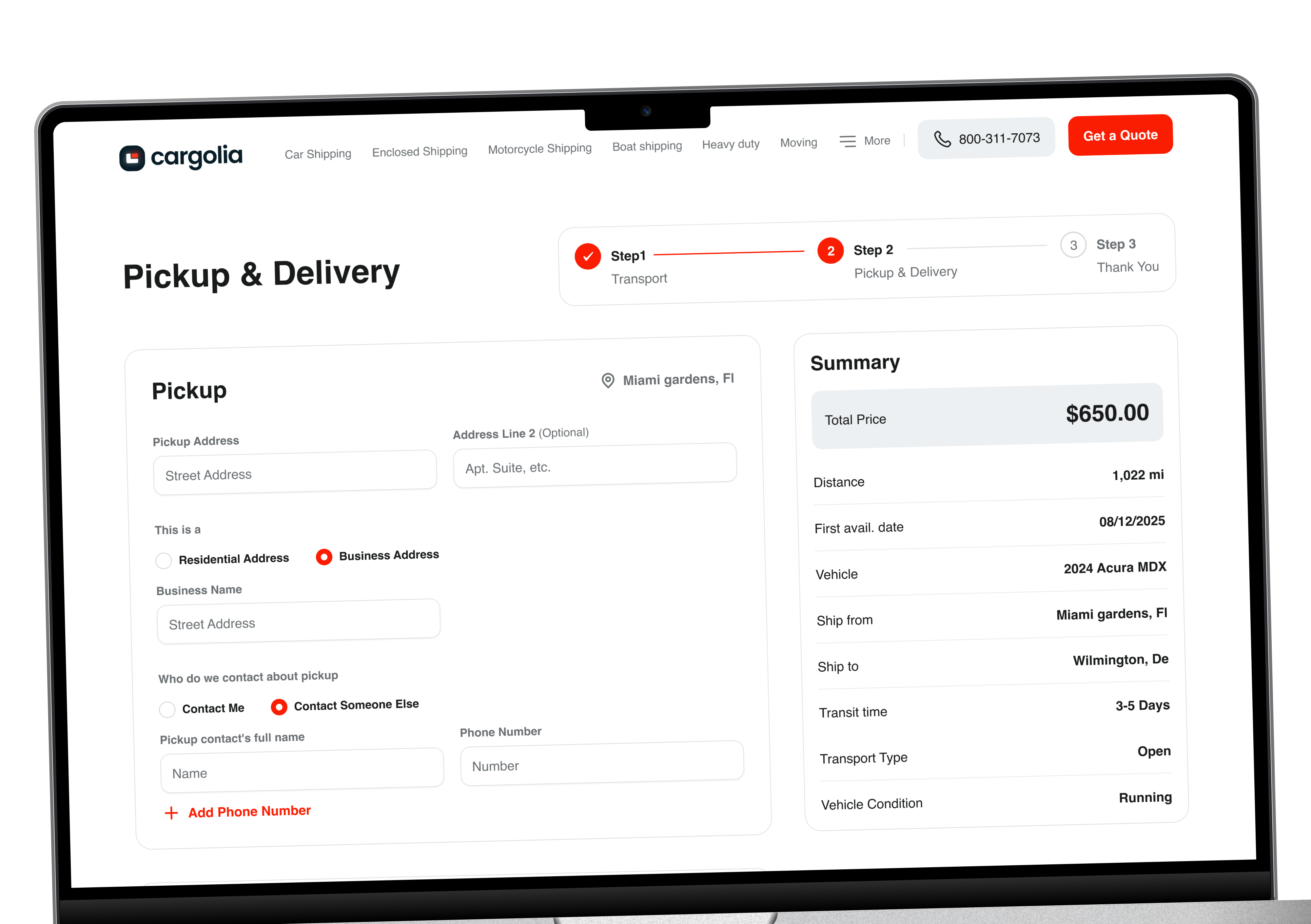
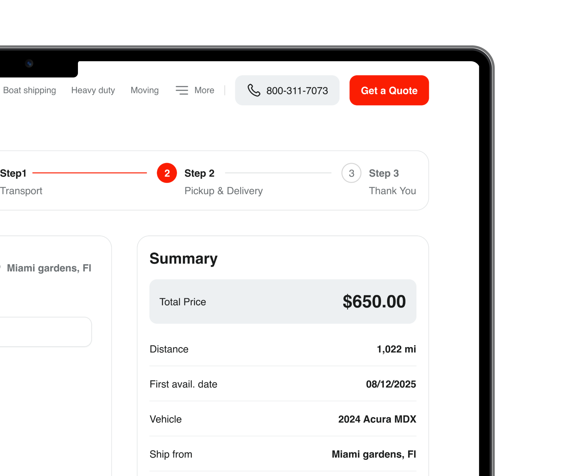
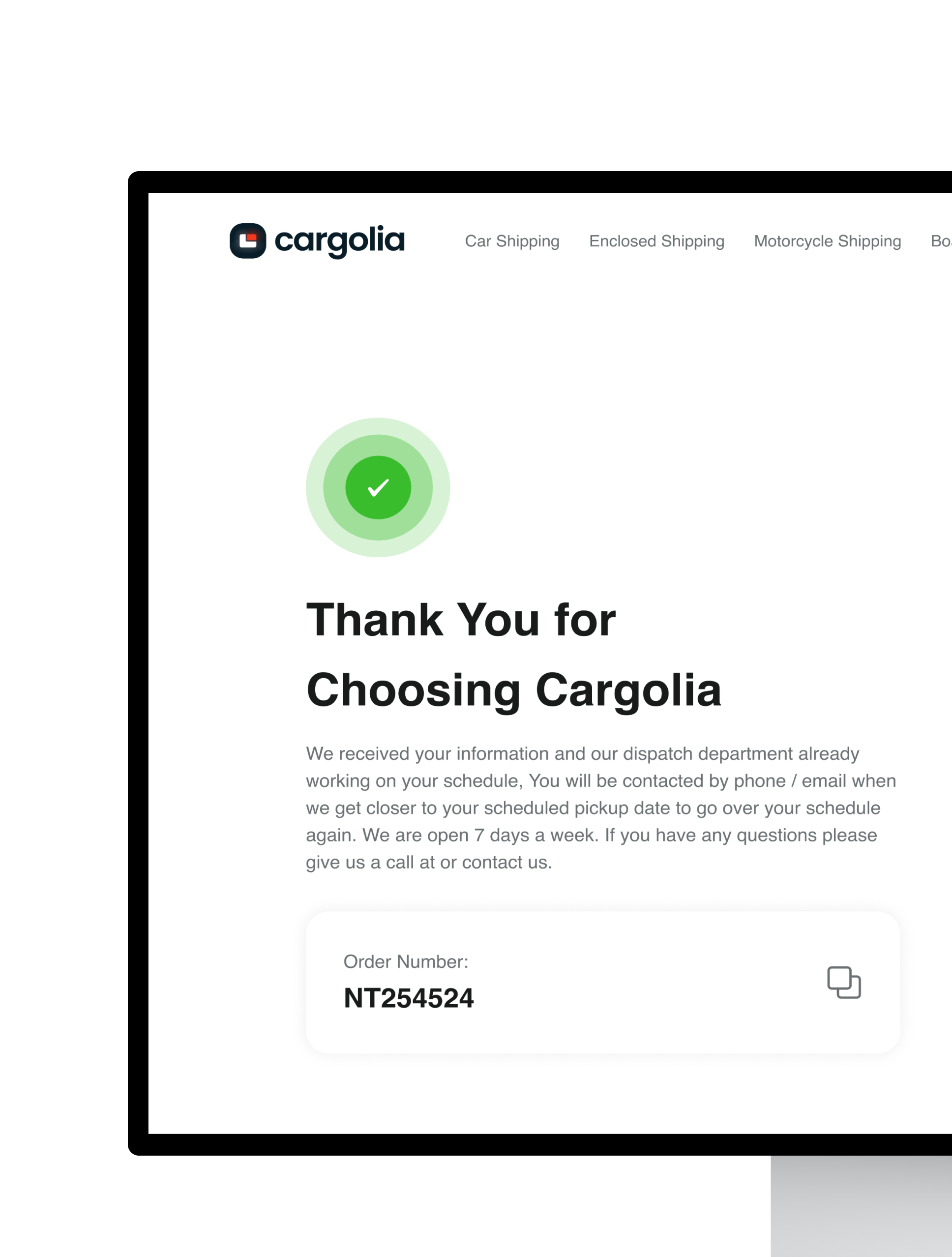
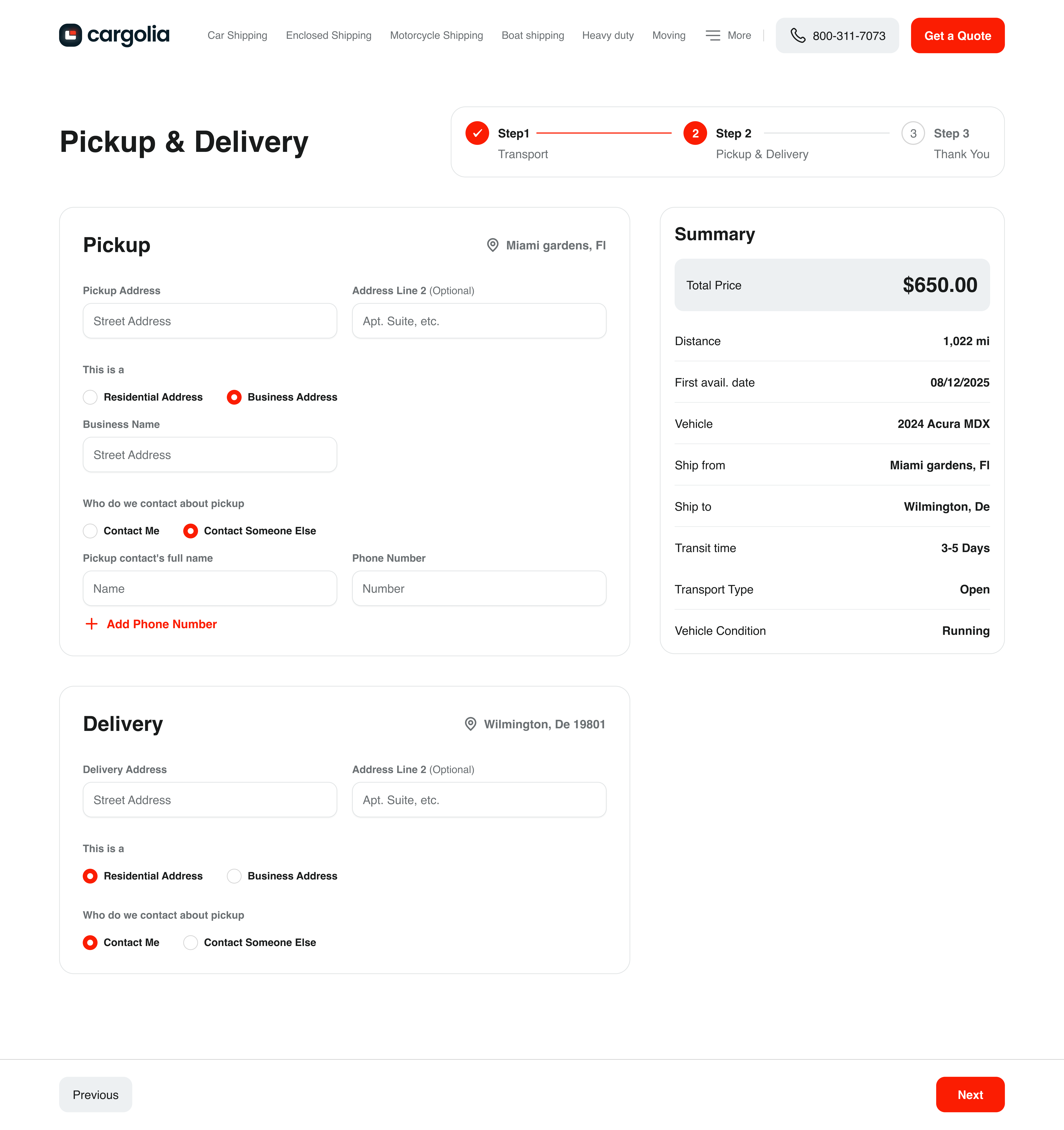
Multi-step Solution
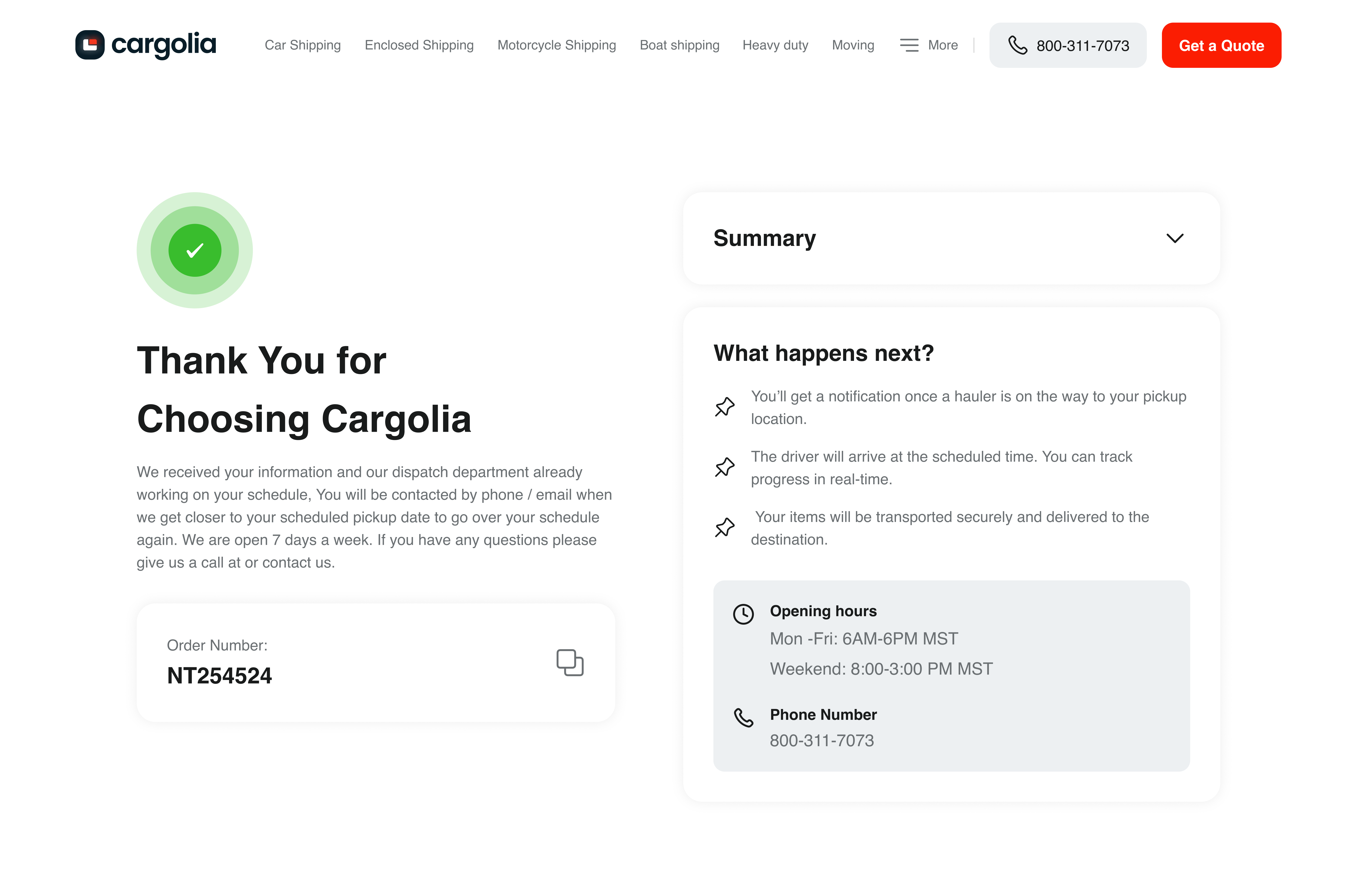
I rebuilt the request form into a clear, multi-step flow, breaking one overwhelming form into simple stages so people always know what to enter and how far they have left. Less friction, fewer drop-offs, more completed quote requests.
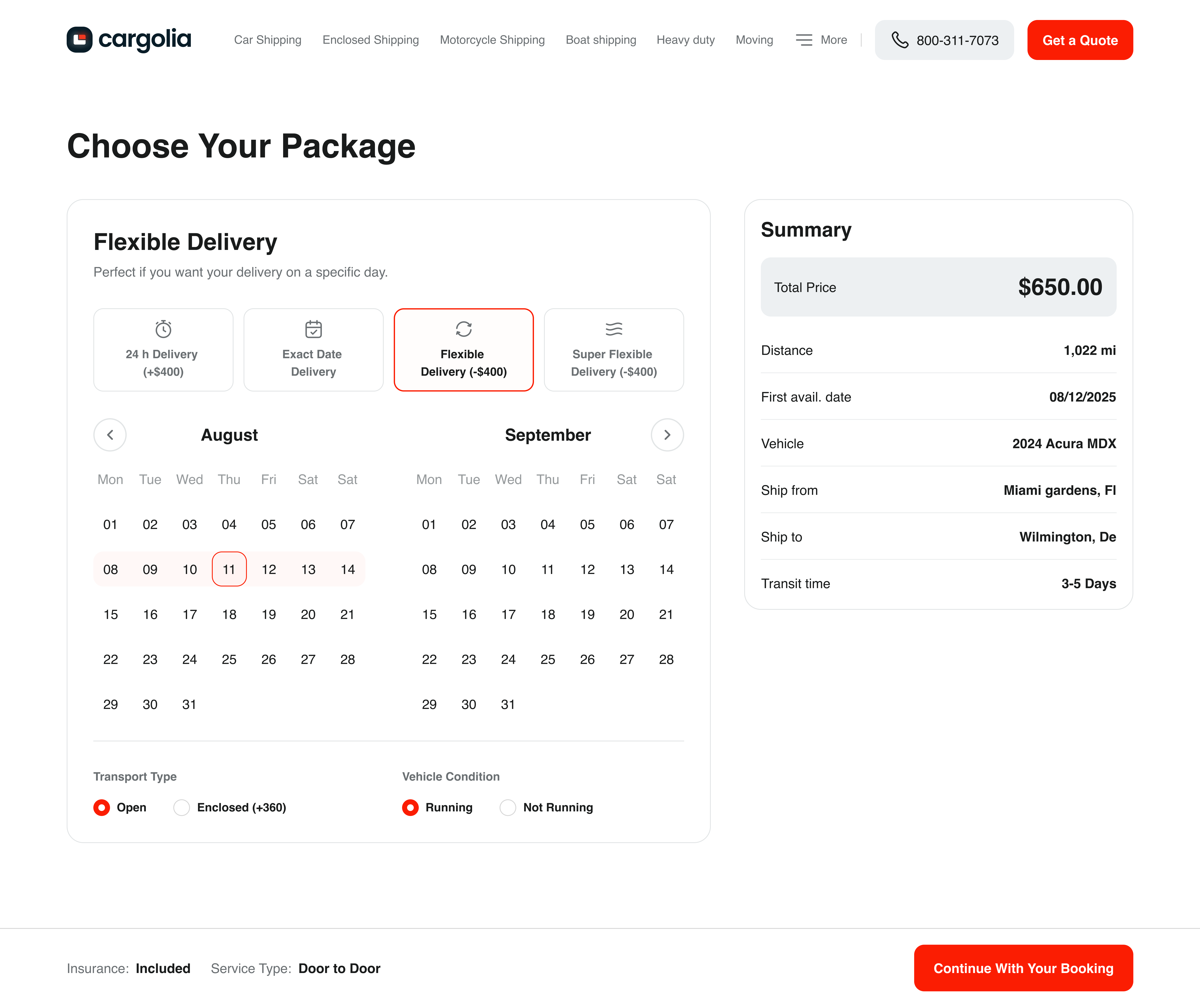
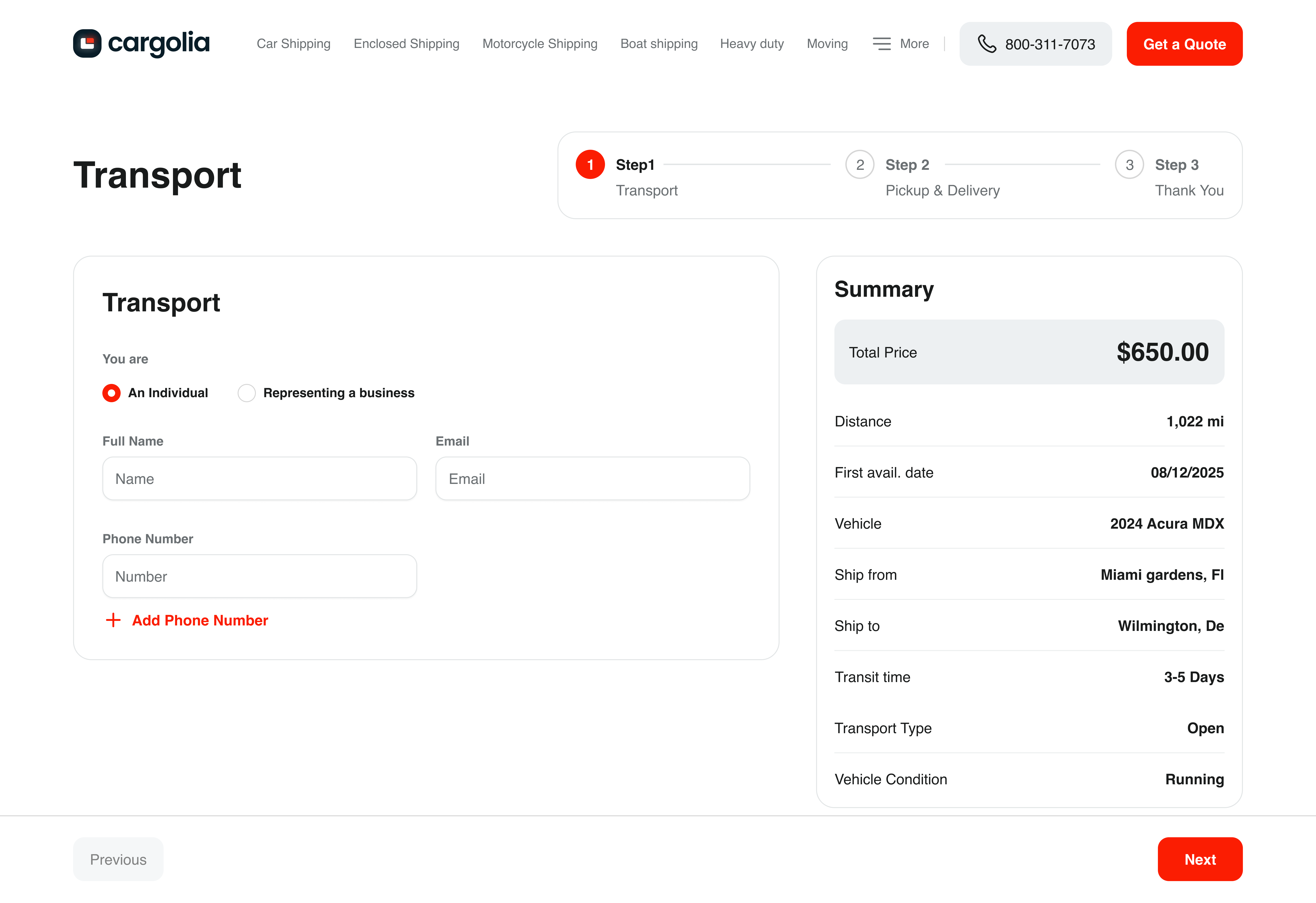
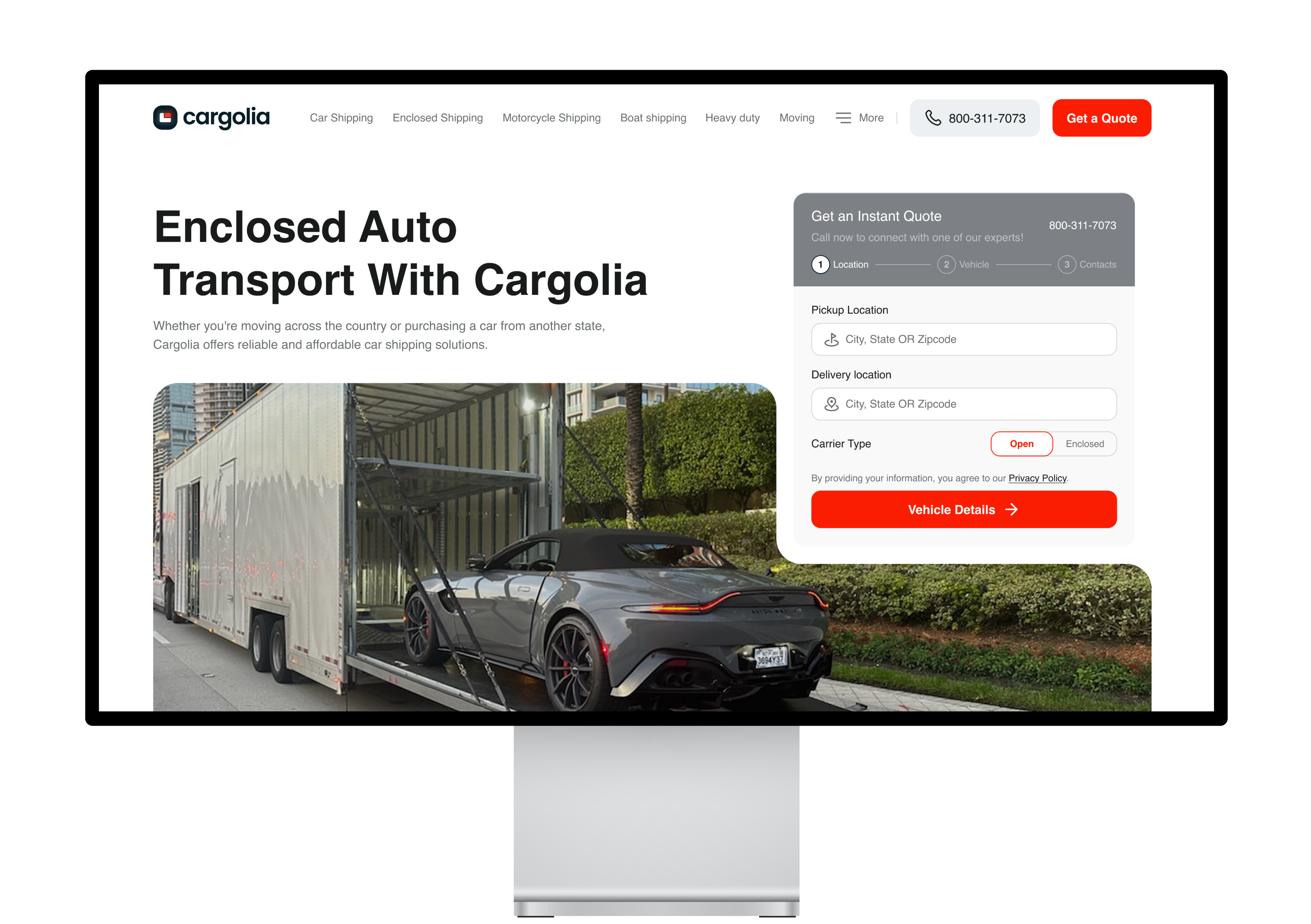
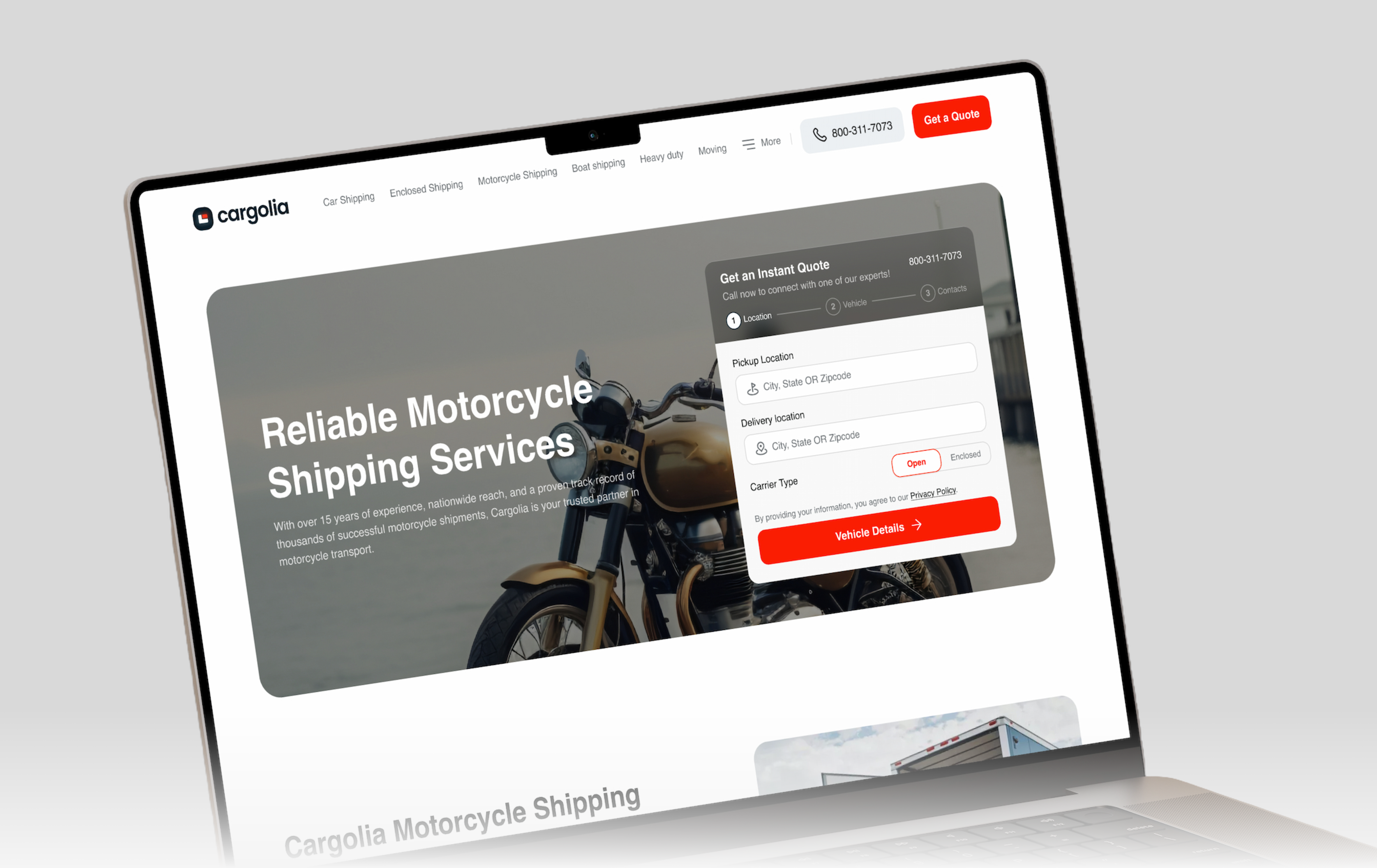
Website Redesigns
In this step, I gave the site a full visual redesign, moving it from something that looked dated and unconvincing to a site that feels modern, credible, and worth trusting with a shipment.